

Profinanss
Design Project - Art direction, Visual identity development, Concept and Graphic design
Tips: English descriptions can be found at the end of the image gallery.
Overview
株式会社プロフィナンスは、事業計画・予実管理・KPI管理・シナリオ分析などを一体的に行える経営DXプラットフォームで「Vividir」を提供する企業です。経営者や事業責任者にとっての経営インフラを強力に後押しする存在として、日本をはじめとしたスタートアップ業界で注目を集めています。檸檬デザイン事務所は、掲社のVI制作を担当しました。

Sketch / Keywords
文字に起こし関係性を明らかにすることで、浮かび上がったキーワードはデザイン作業の際に大きな資源となります。”ProfinanSS”のキーワード列挙し、いつでもこの資料に立ち返ることが出来るようにしておきます。スケッチでは、バランス感を重視し30個ほどの候補を残します。ただし、後ほどマインドマップへ立ち返ることができるため、この時点ではあえて絞り込みすぎないようにします。
Proposal
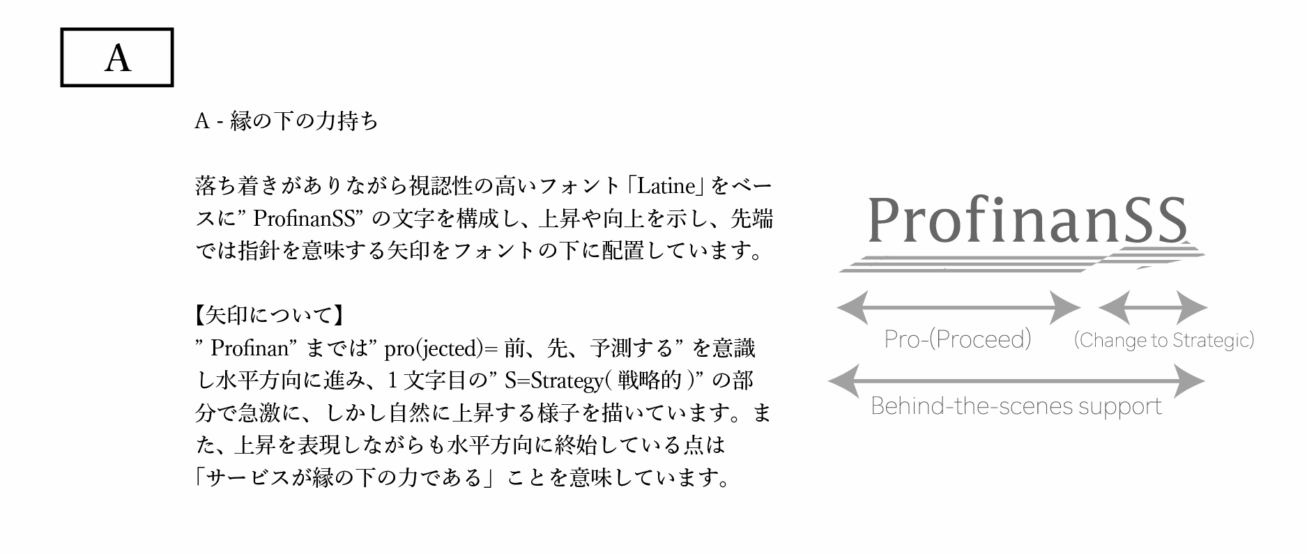
最初の会議で、ヒアリングを基にして作成した3案を提示しました。未来のユーザーがProfinanSSと出会うことで体験する「A.縁の下の力持ち」「B.シナリオの変化」「C.創業期から寄り添う」をテーマにし、B案を中心にさらに検討していくことになりました。
Final Logo Selection
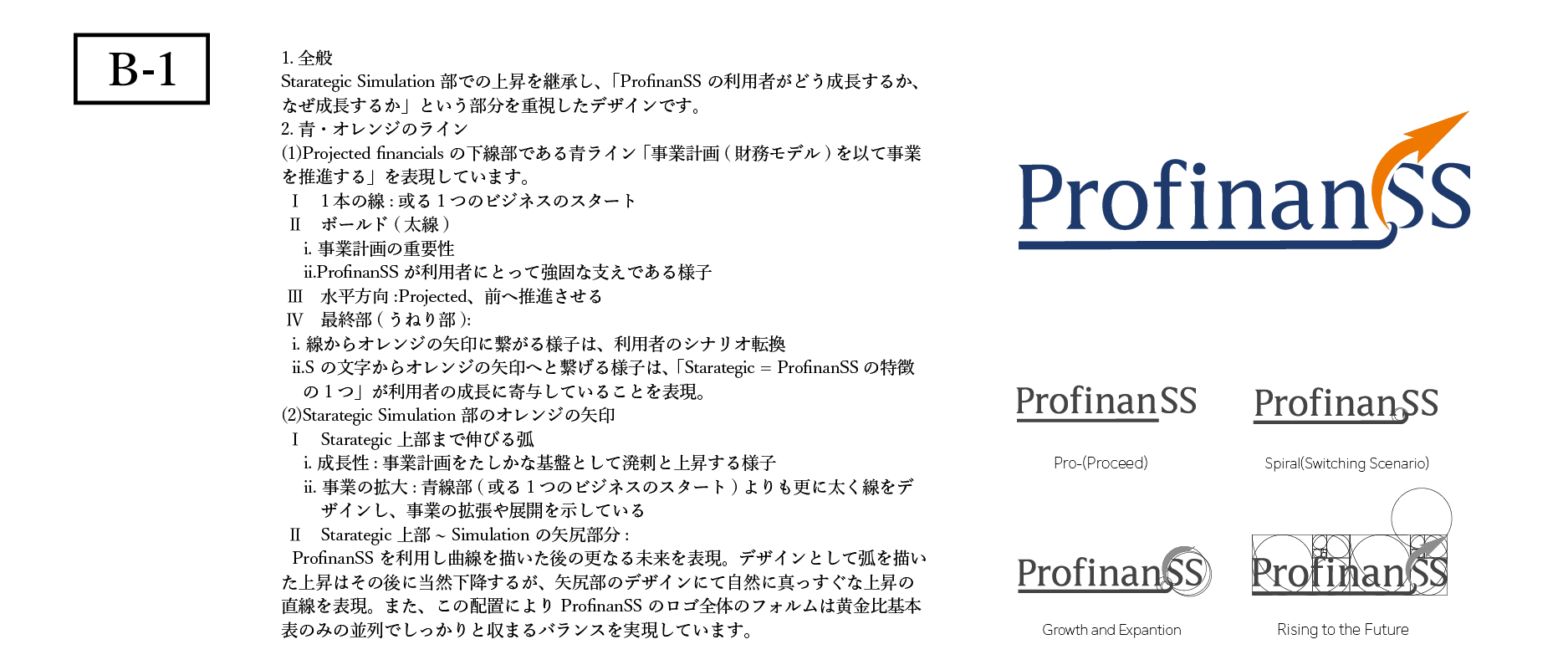
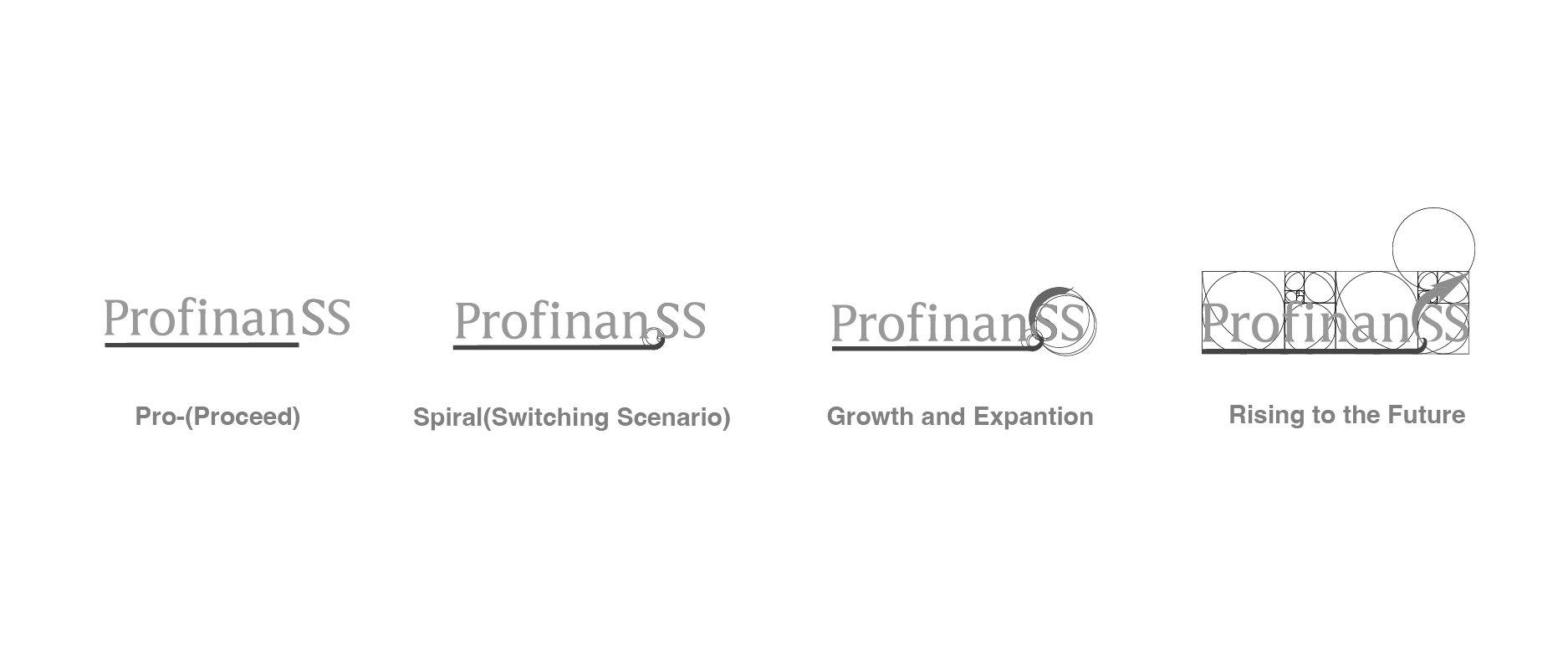
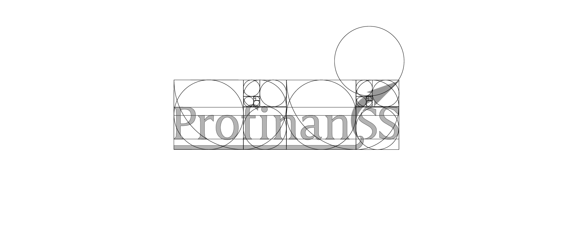
B案「シナリオの変化」を踏襲しながら、「シナリオは分岐・成長・拡大」するという点を加えます。マインドマップに何度も立ち返りながら洗練させ、視認性の高いロゴに決定しました。

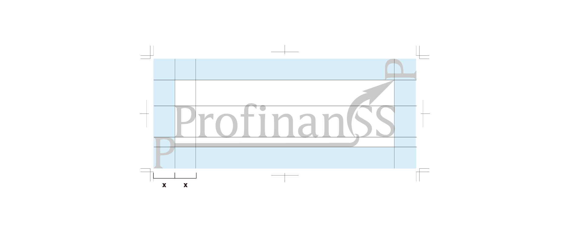
Logo Elements
”ProfinanSS”は「世界を変える」という1本の旗を立てています。また、創業者は世界を変えるという在り方の1つを「新しい動詞を作ること(=人々の新しい行動様式を作ること)」と定義し邁進される決意を示しています。 ”Profinan”までは”pro = 前・予測する”を意識し水平方向にまっすぐと進みます。 1文字目の”S=Strategy(戦略的)”の部分でシナリオが変化し、急上昇する様子を描いています。最終文字“S”と矢印の重なりは、ProfinaSSに関わった人が指針を身につけた様子を表現しています。


Overview
ProfinanSS Inc. offers Vividir, a management DX platform that seamlessly integrates business planning, budget performance tracking, KPI management, and scenario analysis. Positioned as a powerful infrastructure for executives and business leaders, the company is gaining strong attention in Japan’s startup ecosystem and beyond.
Sketch / Keywords
By putting ideas into words and mapping their relationships, we extract keywords that become valuable creative assets during the design process.
For ProfinanSS, these keywords are documented so they can be referenced at any stage.
In the sketch phase, we focus on overall balance and retain around 30 candidates. Since we can always revisit the mind map later, we intentionally avoid over-narrowing the options at this stage.
Proposal
In our initial meeting, we presented three concepts based on the client briefing:
A. The Unsung Hero
B. Shifting Scenarios
C. Partner from Day One
The decision was made to focus on concept B – Shifting Scenarios for further development.
Final Logo Selection
Building on concept B, we added the idea that scenarios branch, grow, and expand.
Through repeated refinement—returning often to the mind map—we arrived at a highly legible and distinctive logo.
Logo Elements The wordmark “ProfinanSS” stands as a symbolic flag for changing the world. The founder defines one way to achieve this as creating new verbs—new ways of acting for people.
・From “Profinan” (pro = forward, to anticipate), the form moves straight ahead horizontally.
・At the first “S” (Strategy), the scenario shifts sharply upward, illustrating growth and transformation.
・The overlap of the final “S” with the arrow represents how those involved with ProfinanSS gain clear direction and purpose.