
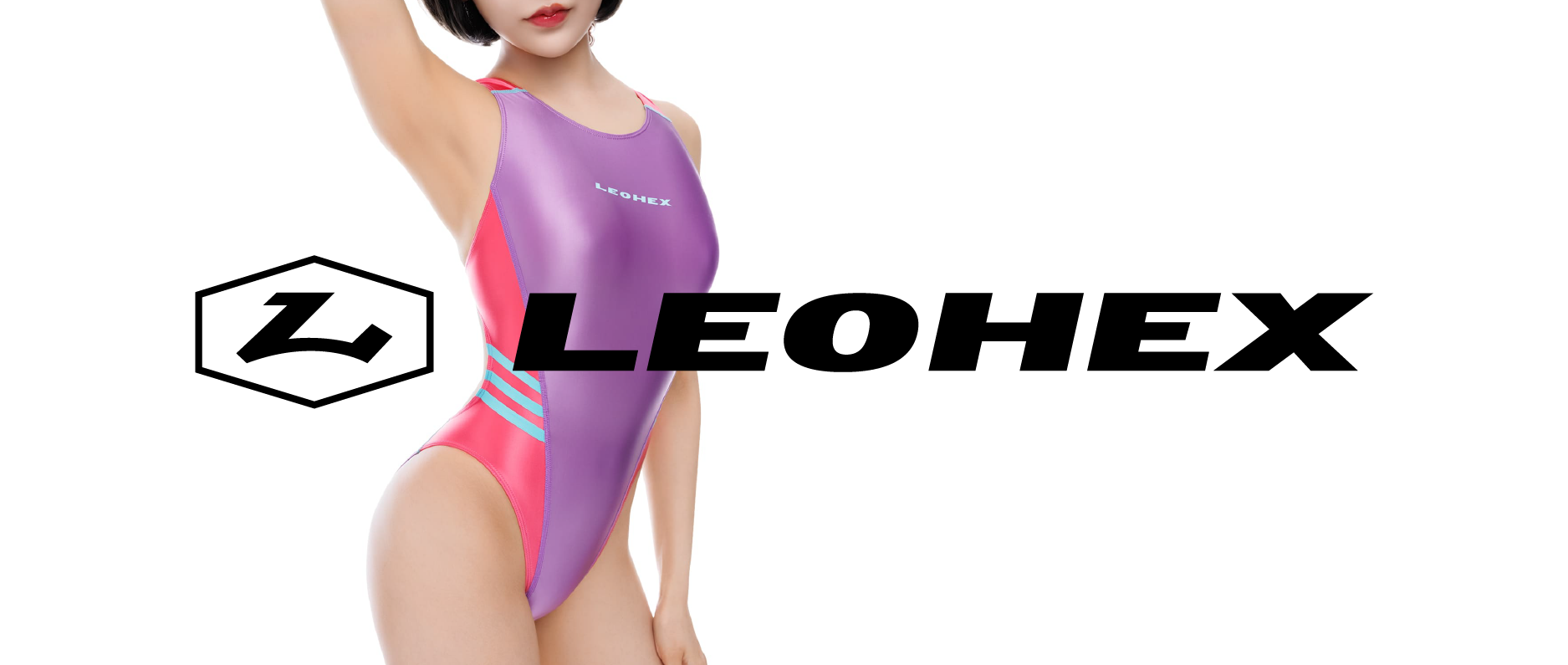
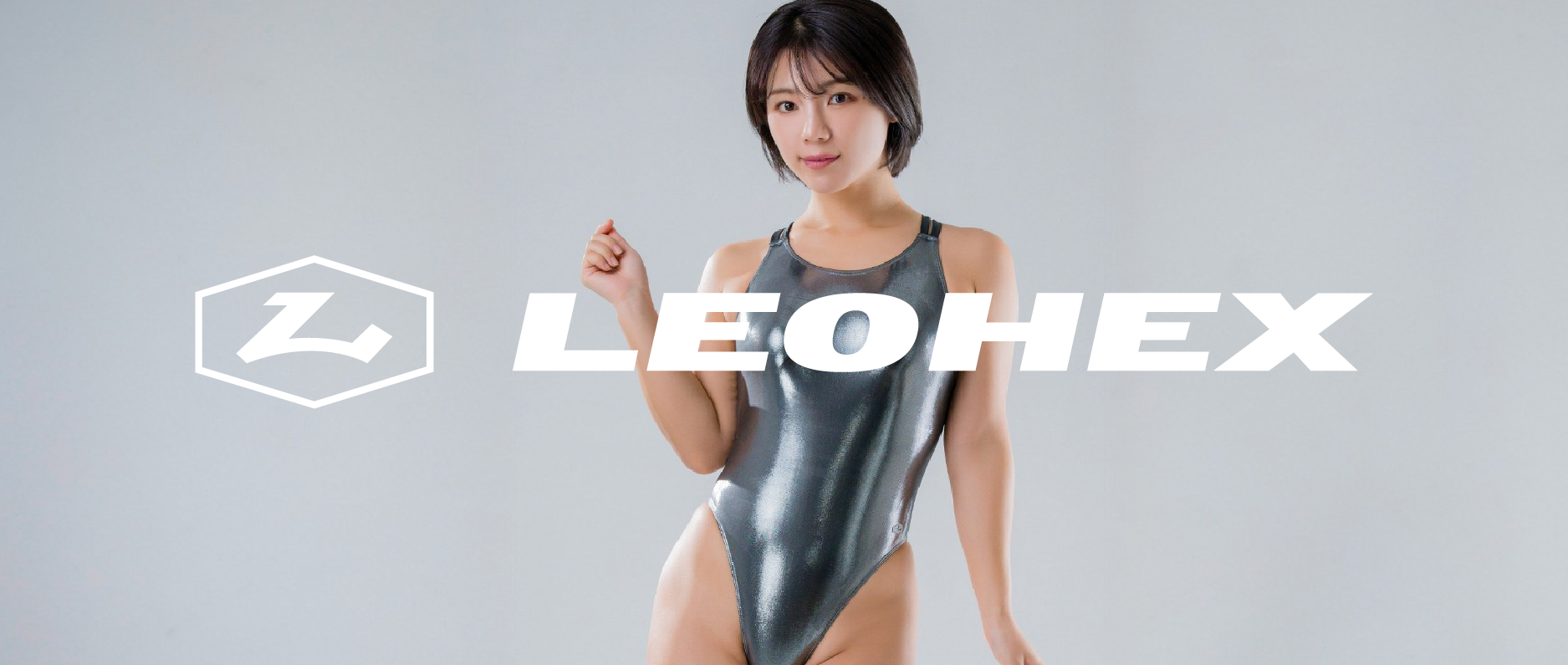
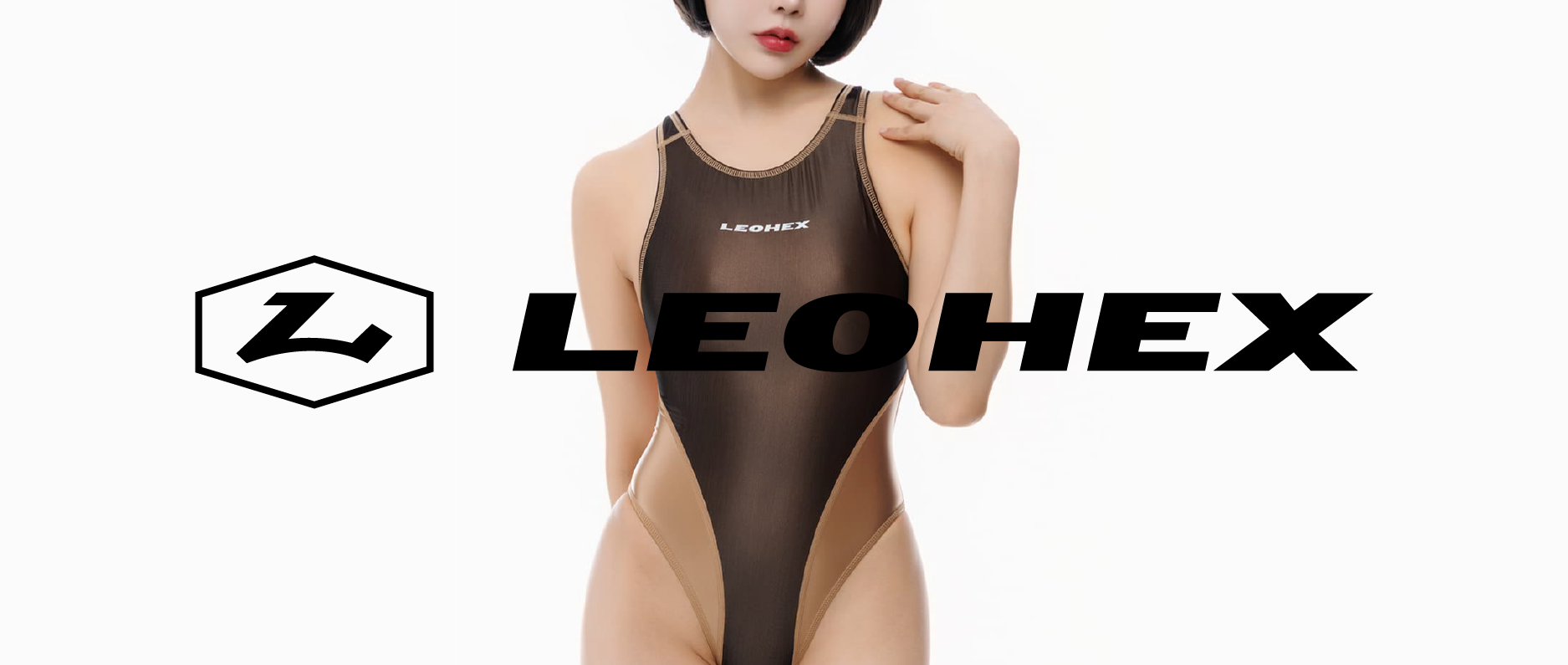
LEOHEX
Design Project - Art direction, Visual identity development, Concept and Graphic design
Tips: English descriptions can be found at the end of the image gallery.
Overview
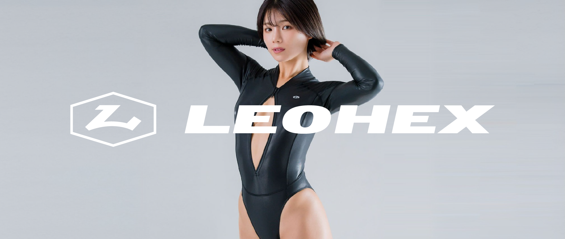
LEOHEXは、日本および中国で著名なアパレルメーカーであり、ハイレグや競泳水着を主戦力商品としています。同製品は様々なユーザーにより毎日SNSへ投稿が見られるほど活況を見せており、競泳水着メーカーとして重要なポジションを担っています。
檸檬デザイン事務所は、さらなる国際展開を見据え、当ブランドのリブランディングを担当しました。

Sketch / Keywords
入念なヒアリングを通じて、今後のLEOHEXブランドの方向性を明確化し、次の基準を設定しました。
シンボルは「L」をベースとし、「L」単体でも確実に認識されること。
「LEOHEX」というワードマークが誤読されず、シンボルと調和していること。
現在および将来にわたり実用性を備えたロゴであること。
ヒアリングで得た知見はすべて記録し、デザインの過程で立ち止まった際に振り返るリソースとして活用します。特に「L」だけでLEOHEXを想起できる強さを重視しながら、スケッチを進めました。
Proposal
スケッチを経て、A・Bの2案を提案しました。両案は同一コンセプトを維持しつつも、曲線の強調かフラットな構成かという点で方向性が分かれます。最終的に、A案が採用されました。

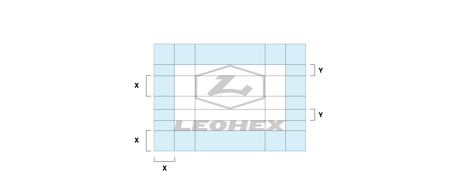
Logo Elements (1/2)
LEOHEXの核となる「洗練されたセクシーさ」を表現するため、曲線的なフォルムを強調しました。「L」の文字は、曲線と始端〜終端の造形によって唯一無二の形を持ち、既存ロゴの印象を受け継ぎつつ、ブランドの進化を強く印象づけます。

Logo Elements (2/2)
さらに、視認性の高い「L」を図形に収めることで独自性を高めました。「L」と「六角形(Hexagon)」を直感的に組み合わせることで、L-Hexa、L-Hex、LEOHEXと自然に連想できるメタファーを生み出しています。
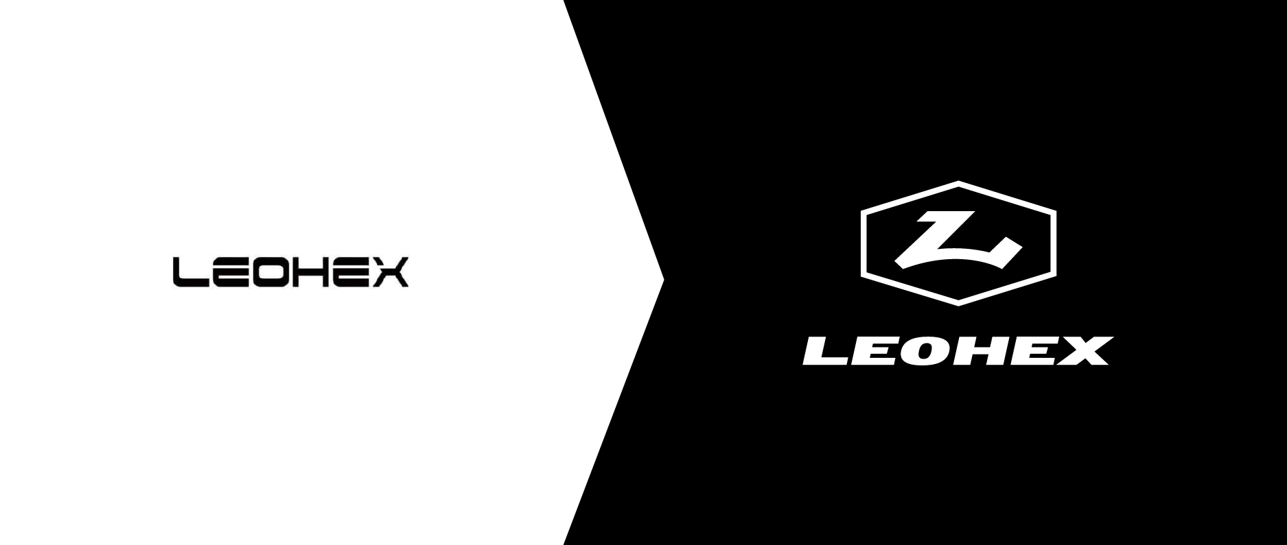
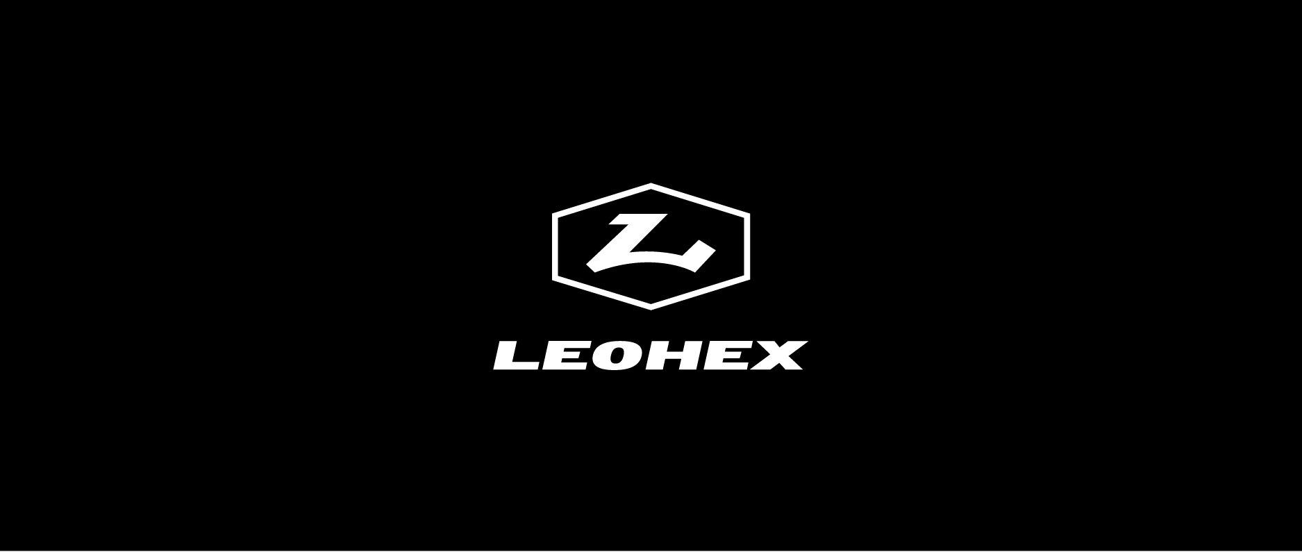
Evolution
旧ロゴとの比較において、当初合意した「L単体での識別性」と「LEOHEXを誤読しない」という要件を満たし、現在・将来を見据えて活用可能なロゴが完成しました。


Overview
LEOHEX is a well-recognized apparel manufacturer in Japan and China, specializing in high-leg and competitive swimwear as its flagship products.
These items have gained remarkable traction, with users sharing daily posts on social media, establishing the brand as a key player in the competitive swimwear market.
Lemon Design Office undertook the rebranding of LEOHEX, positioning the brand for further international expansion.
Sketch / Keywords
Through extensive interviews, we defined the future direction of the LEOHEX brand, establishing the following key criteria:
The symbol must be based on the “L” and recognizable on its own.
The wordmark “LEOHEX” must be unmistakable in its reading and harmonize with the symbol.
The logo must remain practical both now and in the future.
Insights gathered from interviews were carefully documented, ensuring they can be revisited whenever creative direction reaches an impasse.
With a focus on making the “L” strong enough to stand as the core identifier of LEOHEX, sketches were developed.
Proposal
Two design proposals, A and B, were created from the sketches.
While both stemmed from the same concept, the variations emphasized different qualities—one highlighting curves, the other prioritizing flat geometry.
Ultimately, Proposal A was selected.
Logo Elements (1/2)
Emphasizing the brand’s signature quality of “sophisticated sensuality,” the design accentuates curves to convey elegance without vulgarity.
The “L” achieves a unique form through its distinctive curvature and start-to-end detailing, inheriting the essence of the existing LEOHEX logo while signaling a significant step forward in brand evolution.
Logo Elements (2/2)
The symbol’s distinctiveness is reinforced by enclosing the highly recognizable “L” within a geometric frame.
This integration of the “L” with a hexagonal form creates a visual metaphor linking L-Hexa, L-Hex, and LEOHEX, enhancing memorability and conceptual depth.
Evolution
Compared with the previous logo, the new design fulfills the foundational principles: ensuring the “L” is instantly identifiable and that “LEOHEX” is unmistakably read as LEOHEX.
The result is a logo that is both timeless and future-ready.