

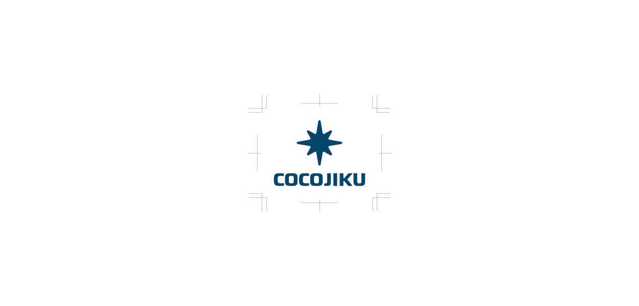
COCOJIKU
Rebranding Project - Art direction, Visual identity development, Concept and Graphic design
Tips: English descriptions can be found at the end of the image gallery.

Overview
キャリア形成プログラム「COCOJIKU」は、キャリア形成に課題を感じる方々に対し、数ヶ月単位の個別プログラムを提供することで、自己理解とキャリア構築を実現するサービスです。『ロジカルに自分を明確に言語化・可視化し、やりたいことからキャリアを考える』というミッションのもと、国内の多くの社会人の次なる一歩をサポートしています。

Sketch / Keywords
ブランド・アイデンティティ(VI)の設計にあたり、まずキーワードの選定とスケッチ制作を実施しました。代表者へのヒアリングを通じて、「信頼性」や「論理的な機会の提供」といったキーワードを抽出するとともに、COCOJIKUならではの「パーソナルな温かさ」や「ハッとする閃き」を得られる点にも着目しながらスケッチを進めました。

Proposal
スケッチの後、いくつかの案を提示しました。キャリア形成支援サービスとしての基本方針は変わらないものの、対外的に伝えたいイメージに合わせてデザインが変化しています。 ※本プロジェクトでは複数回の提案機会がありましたが、このページでは一部を抜粋して紹介しています。

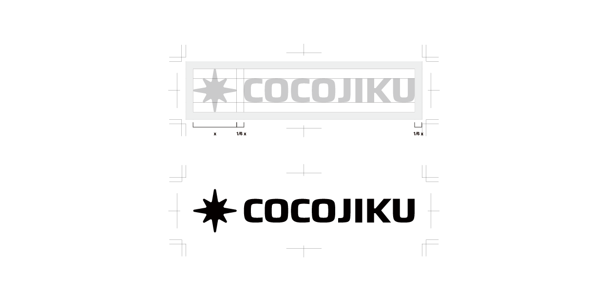
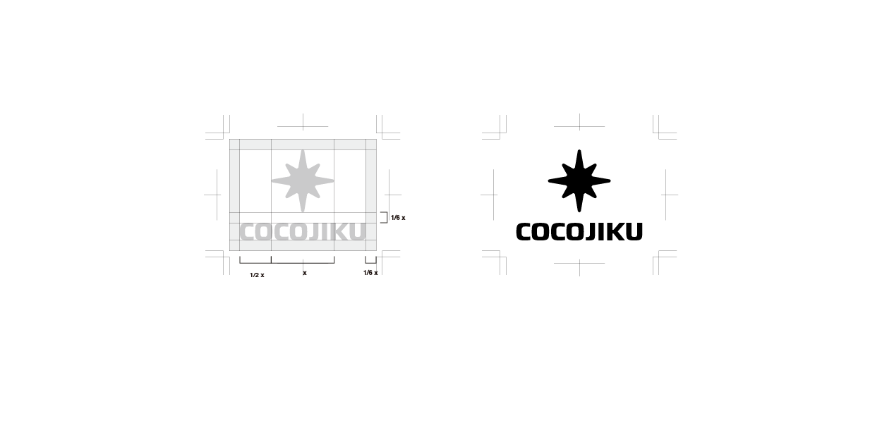
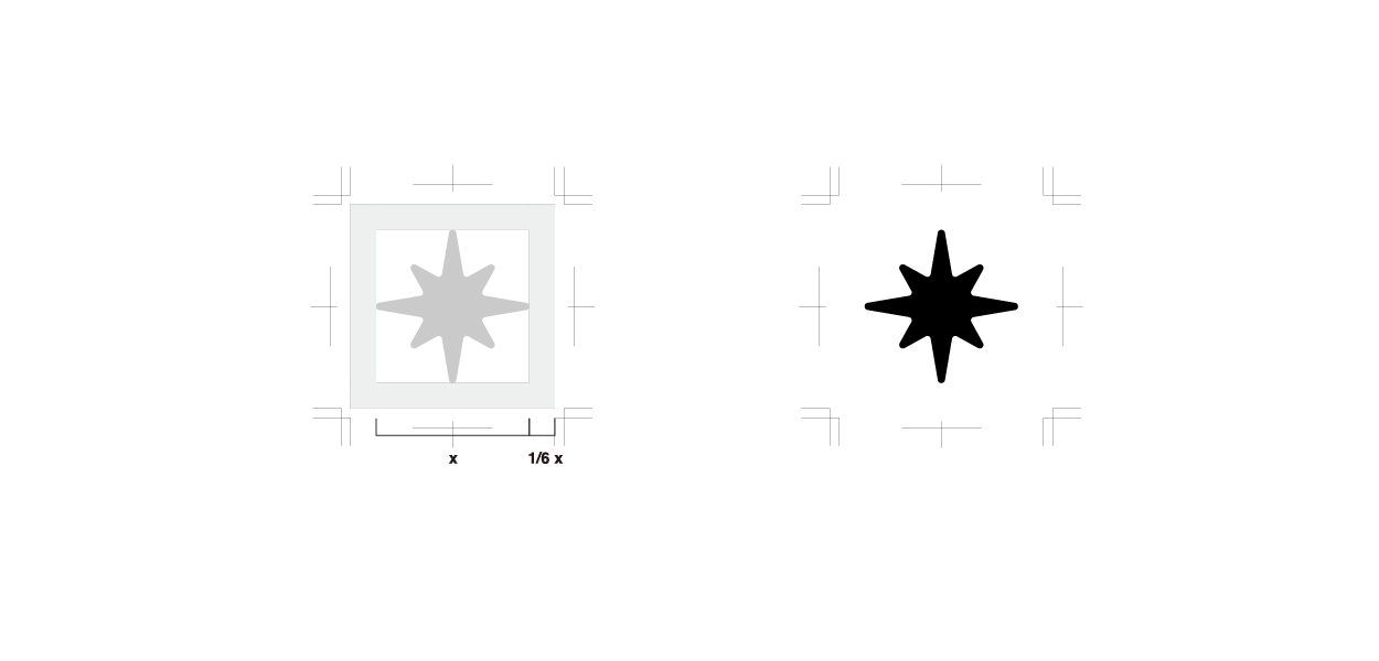
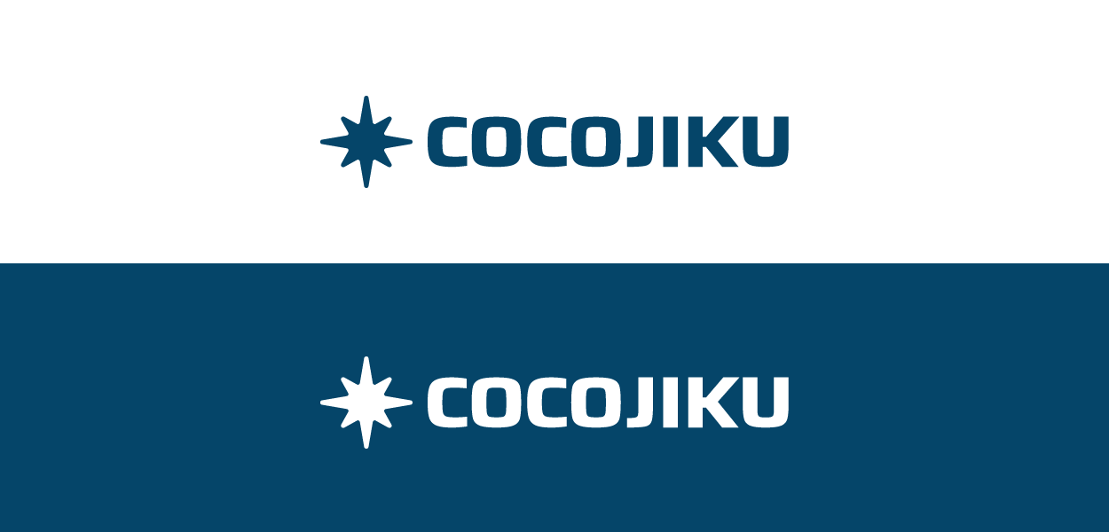
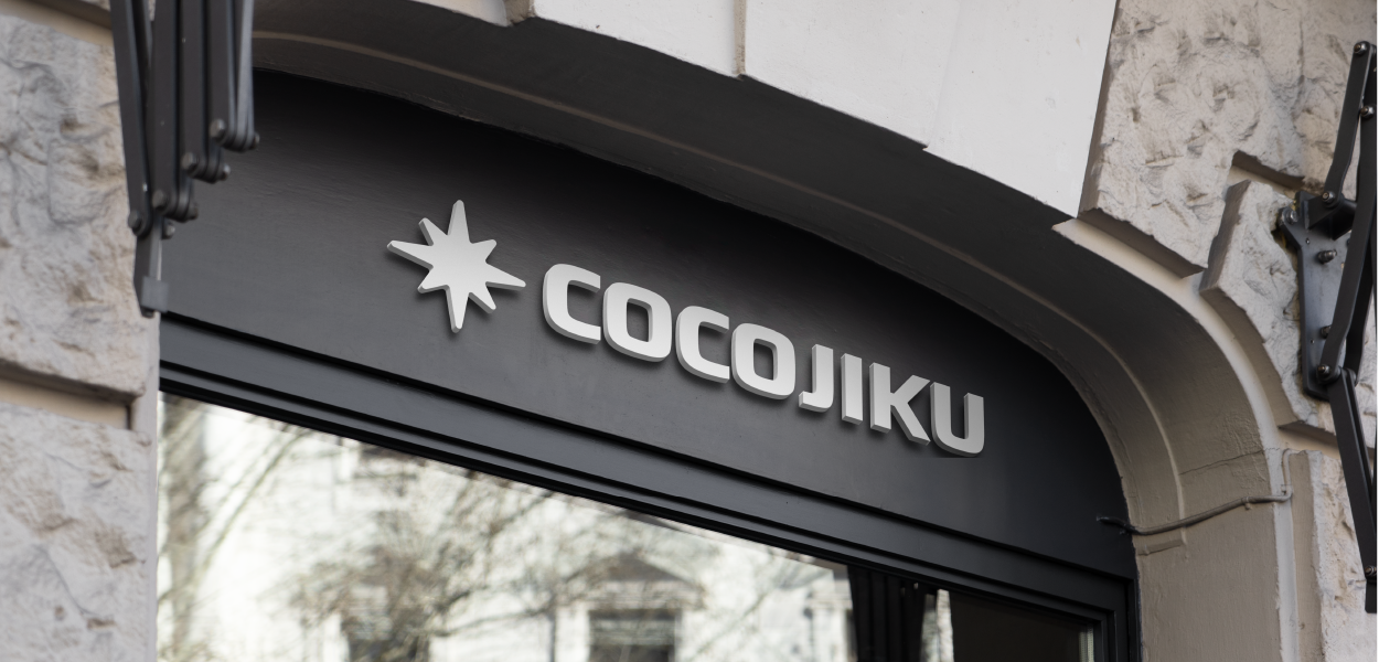
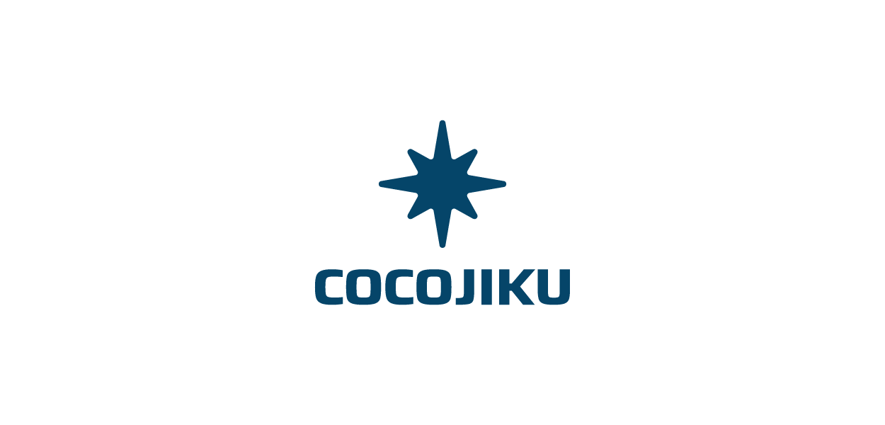
Logo Elements
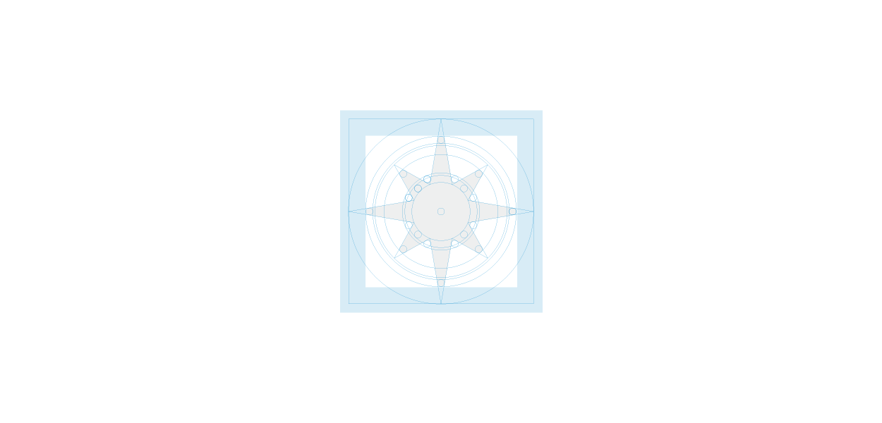
最終的に決定されたシンボルは、羅針盤と北極星を融合させた、いわば「Compolariss(コンポラリス)」と呼べるデザインです。やりたいことを仕事にするためには、幻想ではなく真の「やりたいこと」と、確かな方向性を示すロードマップを獲得する必要があります。これらは、いつも位置を変えずに輝く北極星と、道を示す羅針盤として例えられることが多いです。今回のデザインは、北極星と羅針盤という両面の解釈(VisionとMission)を包括する形となりました。さらに、「ハッとする閃き」を表現する光と、柔らかな丸みを帯びたフォルムは、ヒアリングで感じた温かさも反映しています。

Visualization
本プロジェクトでは、AI画像生成技術を活用し、初期段階でVisionから着想を経てはじめに画像を作成する手法を取っています。 なぜやるのか:キーワードの適否に囚われて制作を進めた場合、アウトプットが矮小化してしまうことがあります。このチャレンジにより、思い切ったスタンスを取ってからデザインすることができ、完成後の展開イメージを最初に共有することで、私たちとクライアントの間に齟齬が生じにくくなる効果が生まれます。


OVERVIEW
The COCOJIKU career development program is a service that provides personalized, multi-month programs to individuals facing challenges in their career progression, enabling them to gain deeper self-understanding and build their careers. With the mission of "logically articulating and visualizing oneself to construct a career based on one’s aspirations," the program supports professionals nationwide in taking their next step.
Sketch / Keywords
In developing the brand identity (VI) for COCOJIKU, we began by selecting key concepts and producing initial sketches. Through discussions with the company representative, we identified keywords such as "reliability" and "providing logical opportunities." In addition, we ensured that our sketches captured COCOJIKU's unique qualities, including its personal warmth and the potential to spark sudden insights.
Proposal
After the sketching phase, we presented several proposals. While the core approach for the career development service remained consistent, the designs were adapted to convey various external impressions.
Note: Although multiple proposals were developed throughout the project, only select examples are featured here.
Logo Elements
The finalized symbol is a design we refer to as "Compolariss"—a fusion of a compass and the North Star (=polaris) .
To transform one’s passion into a career, it is essential to discern one’s true desires (beyond mere illusions) and to establish a clear roadmap that guides one's direction. These elements are often likened to the unwavering North Star and the directional compass. Our final design encapsulates both interpretations, embodying the dual facets of Vision and Mission. Moreover, the inclusion of a radiant element symbolizing a sudden spark of insight, along with a gently rounded form, reflects the warmth we sensed during our discussions.
Visualization
In this project, we harness AI image generation technology to create images early in the process, drawing inspiration directly from the initial vision.
(Why This Approach?)When production is confined strictly by the appropriateness of keywords, the output can sometimes feel limited. By embracing this challenge, we adopt a bold stance from the start. Sharing the envisioned direction early on helps ensure that our creative journey remains closely aligned with the client’s expectations.
Art direction, Visual identity development, Concept and Graphic design:LEMON DESIGN Office
https://www.lemonjp.com/