

檸檬デザイン事務所(LemonJP)
New Project - Self Branding, Visual identity development, Concept and Graphic design
Tips: English descriptions can be found at the end of the image gallery.

Overview
檸檬デザイン事務所は、企業ブランディングに特化したデザインエージェンシーです。このページでは、当事務所のセルフブランディングについて紹介します。

Naming Elements (1/2)
事務所の名前の由来は「LEMON」という語音の普遍性にあります。酸味のある黄色い果実を見たとき、多くの言語話者がほぼ同一の発音を連想します(例:Lemon、Limón、Limone、Лимон、柠檬、레몬、ليمون、Limão)。多様な言語が混在する世界において、この稀少な“共通の響き”に着目することで、ブランドの一貫性と親しみやすさを強調しています。

Naming Elements (2/2)
一度聞けば間違えない優位性
現代は1日に約5,000件もの広告に触れる情報過多の時代です。このような環境下で大企業のネーミング戦略は、「独自性のある名称を付与し、長期的に広告投資と時間をかけてブランドを育成する」ことが一般的です。独自の名前が定着すれば、「グーグル」と聞くだけで検索サイトを連想し、他社と混同されることはありません。企業にとって最高のシナリオと言えるでしょう。
一方、私たちの戦略は大企業とは大きく異なります。非常に小規模なスタートから始め、クライアントワークは1対1が中心です。広く大衆に浸透させるよりも、出会ったお客様一人ひとりに「レモン」と名乗れば必ず「レモン」と呼んでもらえる―この“確実な記憶定着”を最重要視しています。


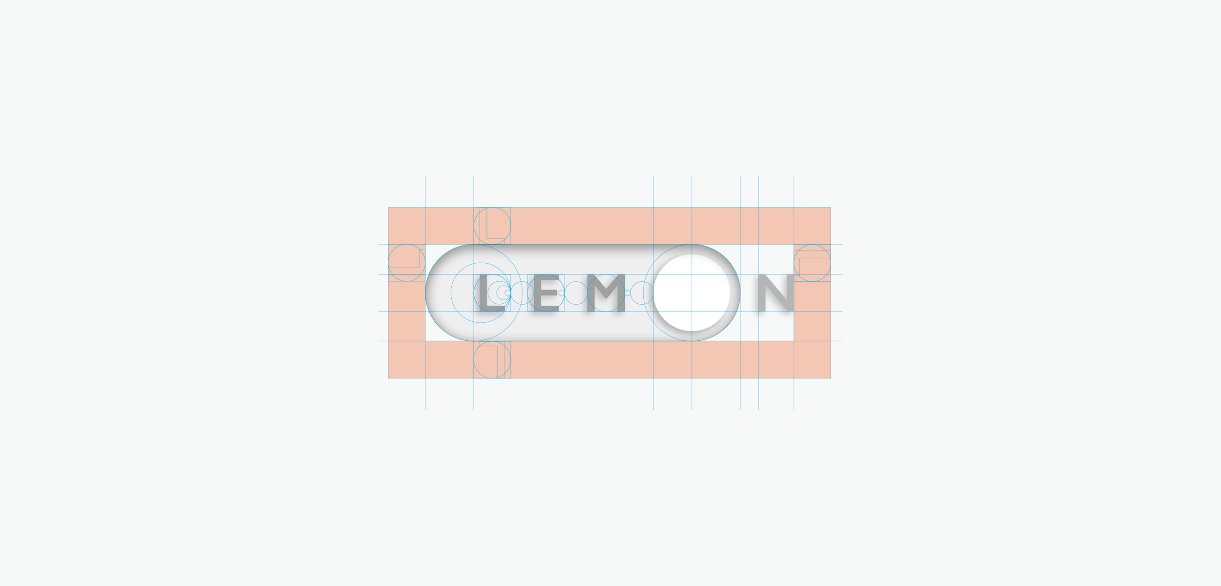
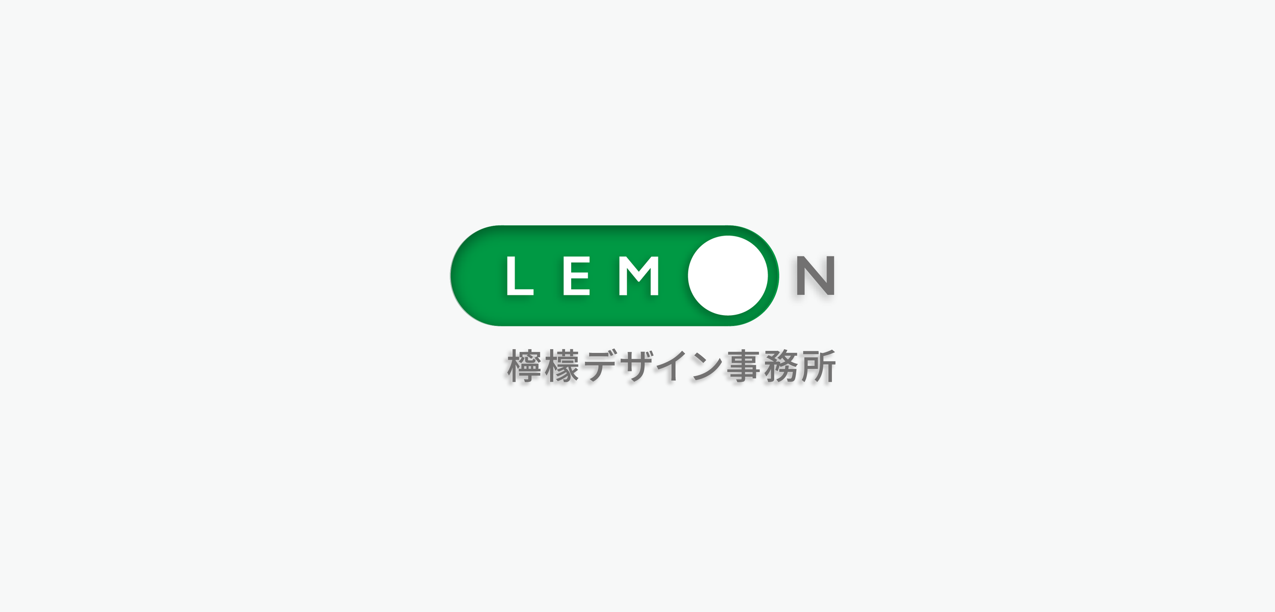
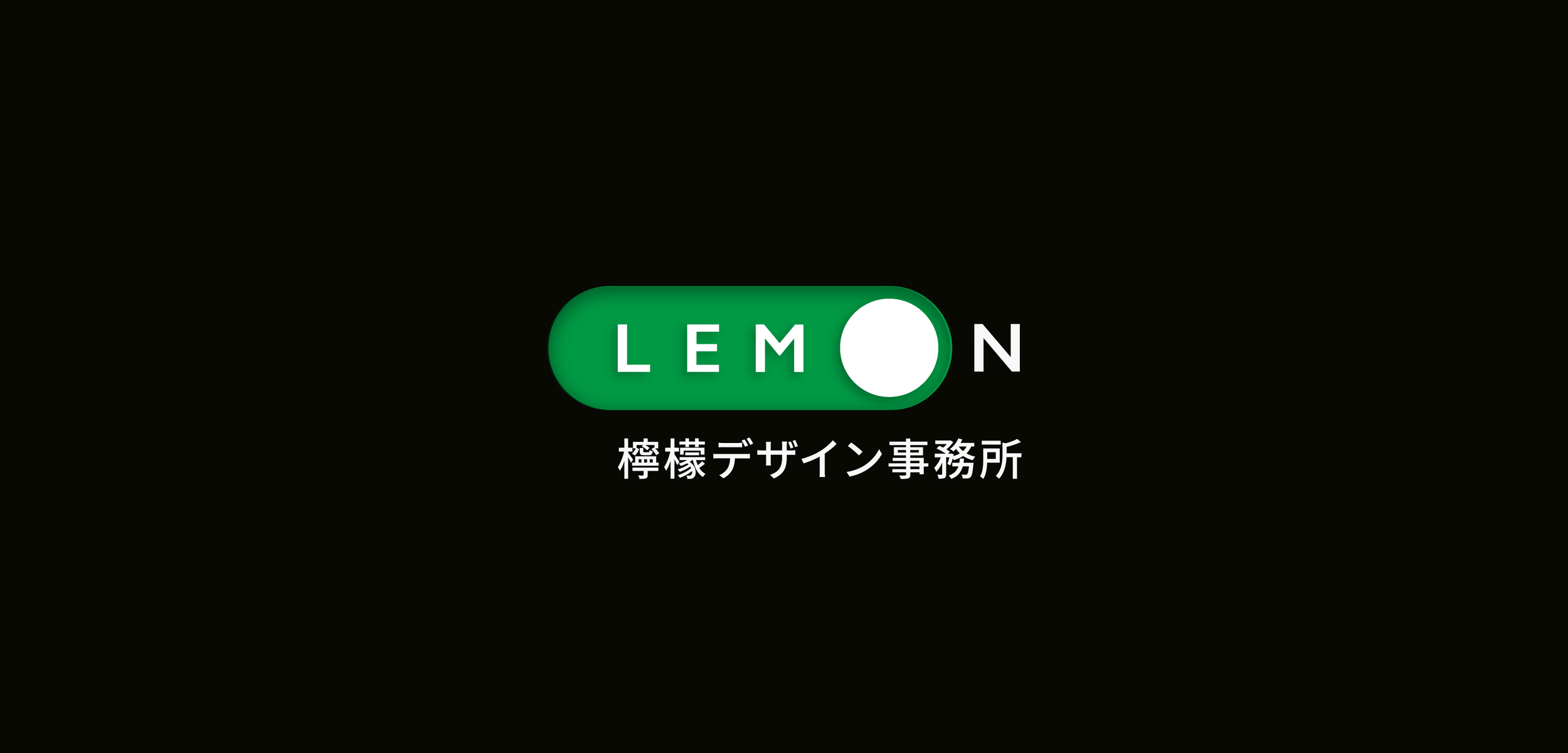
Logo Elements
檸檬デザイン事務所ののブランドモチーフは「スイッチ」です。
社名に含まれるON/OFFの概念と、クライアントに新たな気づきをもたらす役割を掛け合わせ、アイデアの起動点を象徴するデザインアイデンティティを構築しています。

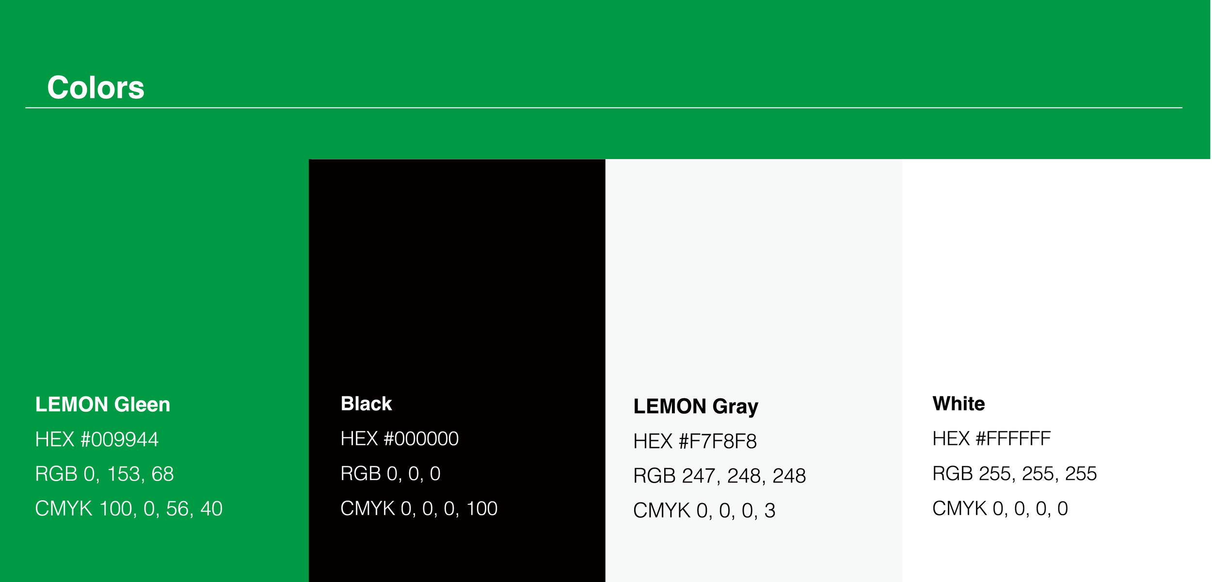
Color Elements
「未熟なレモンの色」で、私達は常に初心を思い出せる。
緑を基調にしたデザインを採用した理由は以下のとおりです。
グリーンは「未熟なレモンの色」。私達は常に初心を思い出せる。
多くのデバイスでスイッチに使われる色であり、「スイッチのデザイン」であることが直感的に伝わる。
同業他社が多用する「シンプルな黒」と差別化できる。
黄色ではなく緑のロゴは「レモンだが黄色でない」という驚きを生み、記憶に残りやすい。


Overview
Lemon Design Office is a design agency specializing in corporate branding. This document presents our approach to self-branding.
Naming Elements (1/2)
Our name derives its strength from the universal phonetic quality of the word “LEMON.” When people across languages see this tart, yellow fruit, they tend to associate it with a nearly identical sound (e.g., Lemon, Limón, Limone, Лимон, 柠檬, 레몬, ليمون, Limão). In a multilingual world, this rare shared pronunciation becomes a valuable asset—reinforcing both brand consistency and approachability.
Naming Elements (2/2)
Distinctive, instantly memorable naming
We live in an era of information overload where individuals encounter thousands of advertising messages daily. Large corporations typically respond by creating distinctive names and investing heavily—both in time and media—to build broad brand recognition. Once established, such names trigger immediate association. Our strategy differs: starting small and focusing on one-to-one client engagements, we prioritize assured recall among the people we meet. In short: when we introduce ourselves as “Lemon,” we want clients to remember—and use—that name without fail.
Logo Elements
Our brand motif is the “switch.” It combines the ON/OFF concept implicit in our name with our role as a catalyst for client insights—symbolizing the moment ideas are activated and brought to life.
Color Elements
We chose a green tone reminiscent of an unripe lemon as our primary color for several reasons:
It symbolizes freshness and a continual return to our founding mindset.
Green is commonly used for switches across devices, helping to intuitively communicate the “switch” motif.
It stands apart from the black-dominant palettes commonly used by competitors.
A green logo for “Lemon” creates a memorable, unexpected twist—“it’s Lemon, but not yellow”—which aids recall.
Art direction, Visual identity development, Concept and Graphic design:LEMON DESIGN Office
https://www.lemonjp.com/