
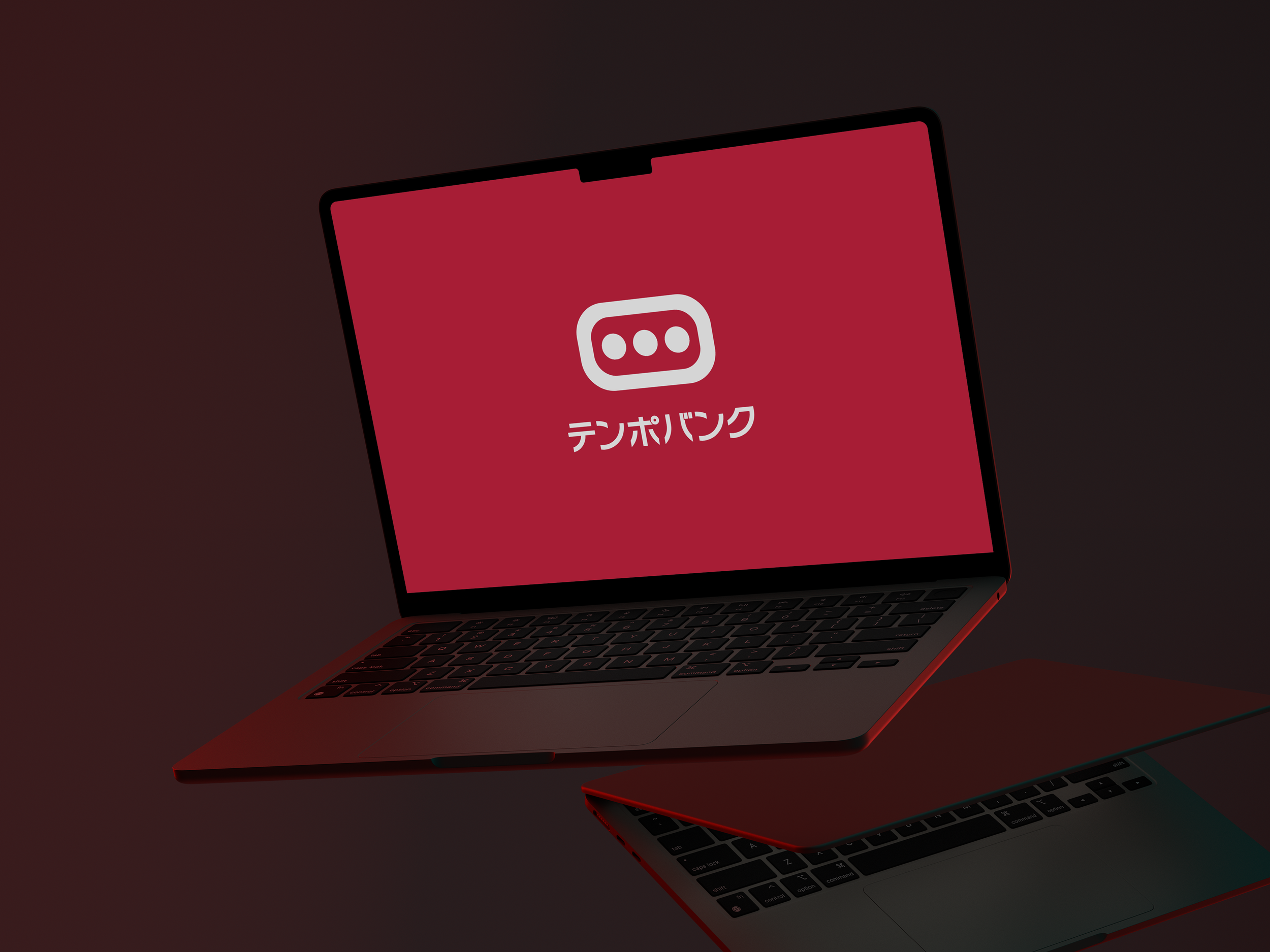
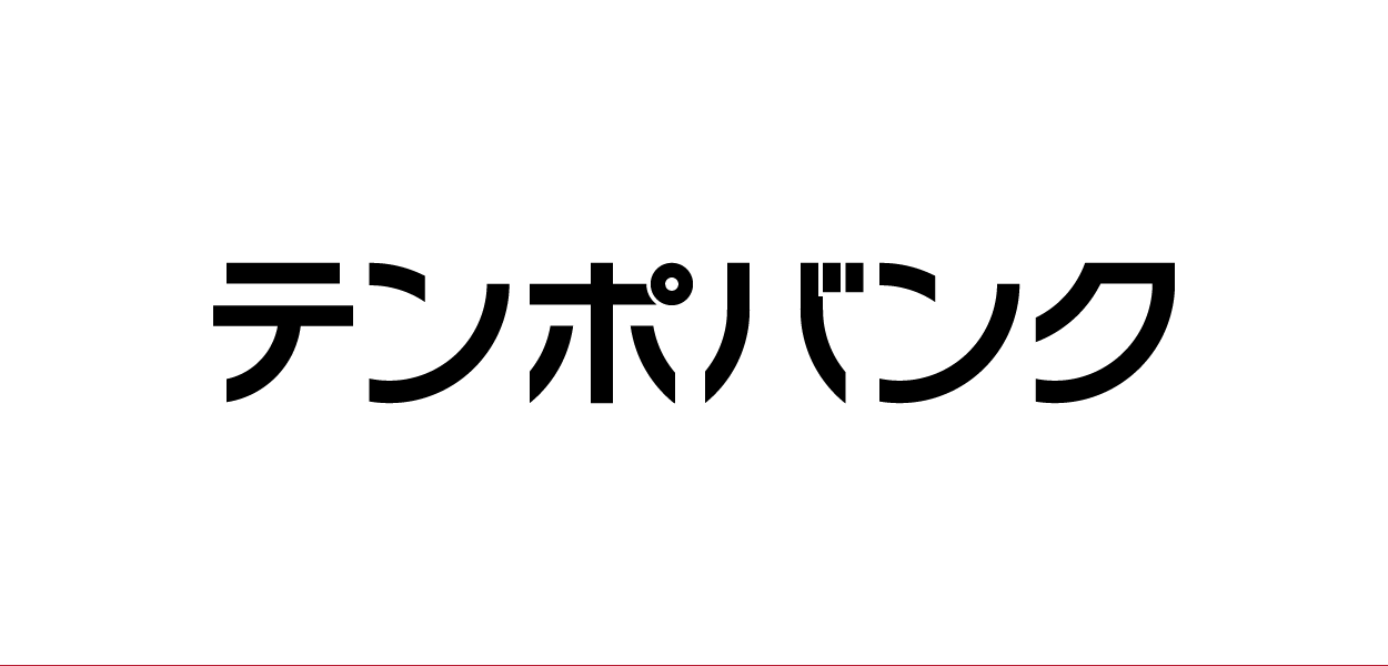
テンポバンク(TEMPO BANK INC.)
Design Project - Art direction, Visual identity development, Concept and Graphic design
Tips: English descriptions can be found at the end of the image gallery.

Overview
株式会社テンポバンクは、東京を拠点とする不動産会社です。特に、商業店舗の出店や退店に関する総合的なサポートを強みとしており、借主と貸主の間に立ち、双方にとって最良の結果を導くための挑戦を続けています。 本プロジェクトでは、檸檬デザイン事務所がブランド・アイデンティティ(VI)の設計とロゴガイドラインの策定を担当しました。

Sketch / Keywords
ブランド・アイデンティティ(VI)の設計に際し、まずはコアメンバーへのヒアリングを通じて、テンポバンクにとって本質的な価値観を言語化しました。 導き出されたキーワードは、「貸主・借主・自社の三者が共に成長すること」、そして「現場の声を起点に、継続的に改善を重ねていく姿勢」。これらの考えを基盤に、スケッチの初期フェーズでは、成長・連携・柔軟性といった要素を視覚的に表現する手法を模索しました。

Proposal
3案を提示したうち、現行のベースとなるB案が選定されました。事前のヒアリングを丁寧に行ったものの、シナリオの解釈のわずかな違いによって、複数の方向性が自然に生まれる結果となりました。 「貸主・借主・自社が全員成長する」という共通認識を起点に、以下の3つのアプローチに分岐しています。
借主に親しみやすさを感じてもらえる図案
事業性をストレートに伝える図案
コミュニケーションの重要性を前面に出す図案
その後も丁寧に対話を重ねながら、最終案が確定していきました。

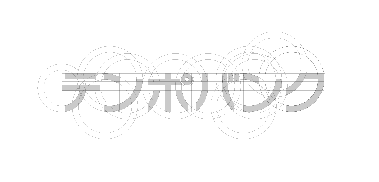
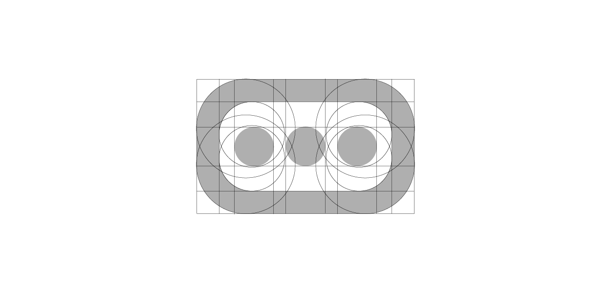
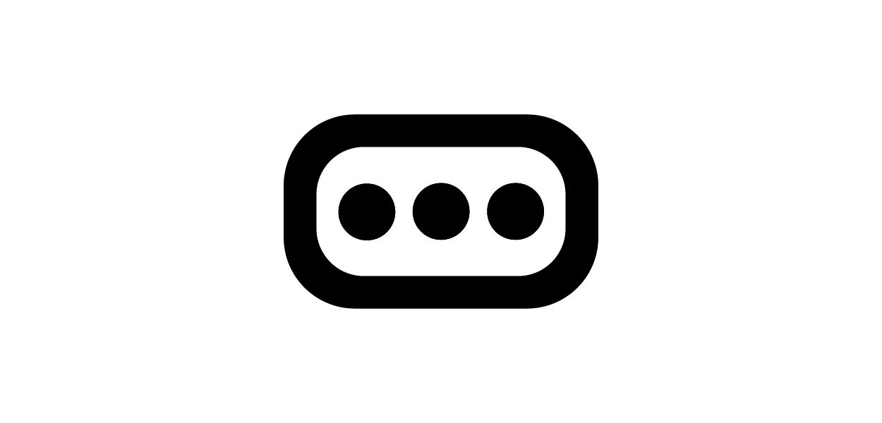
Logo Elements
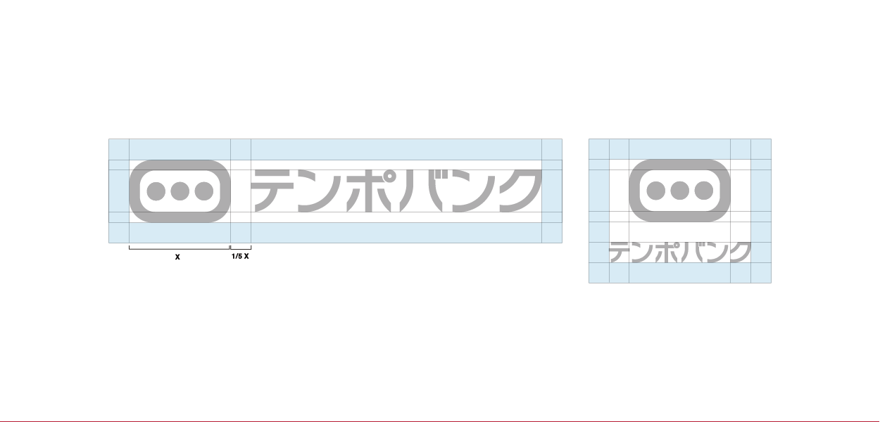
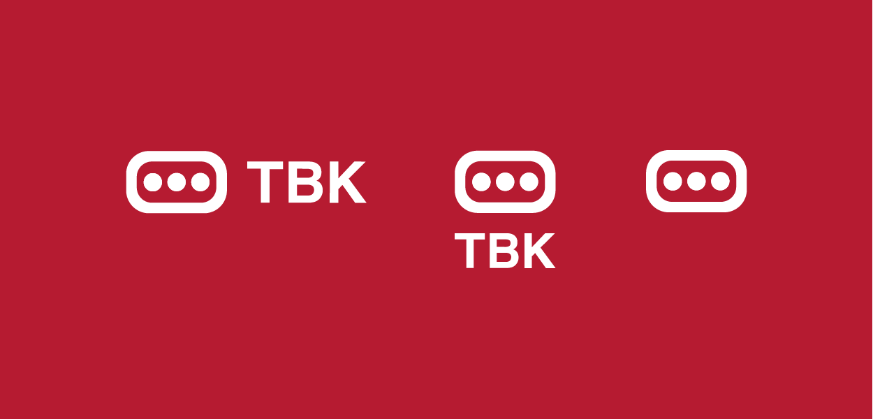
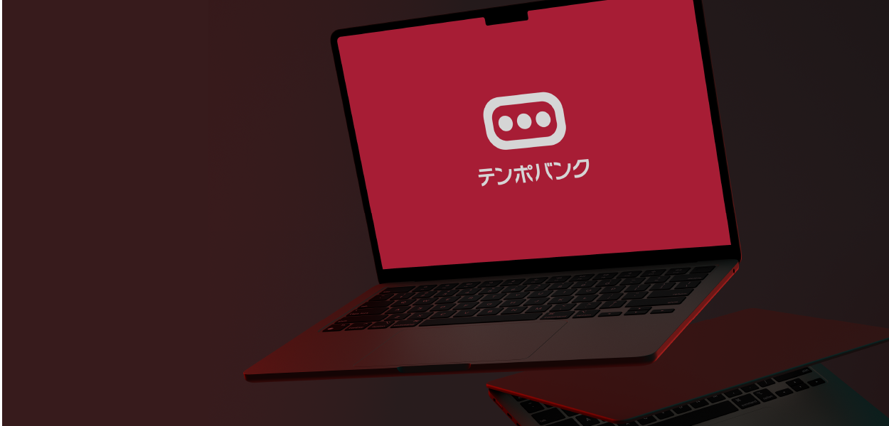
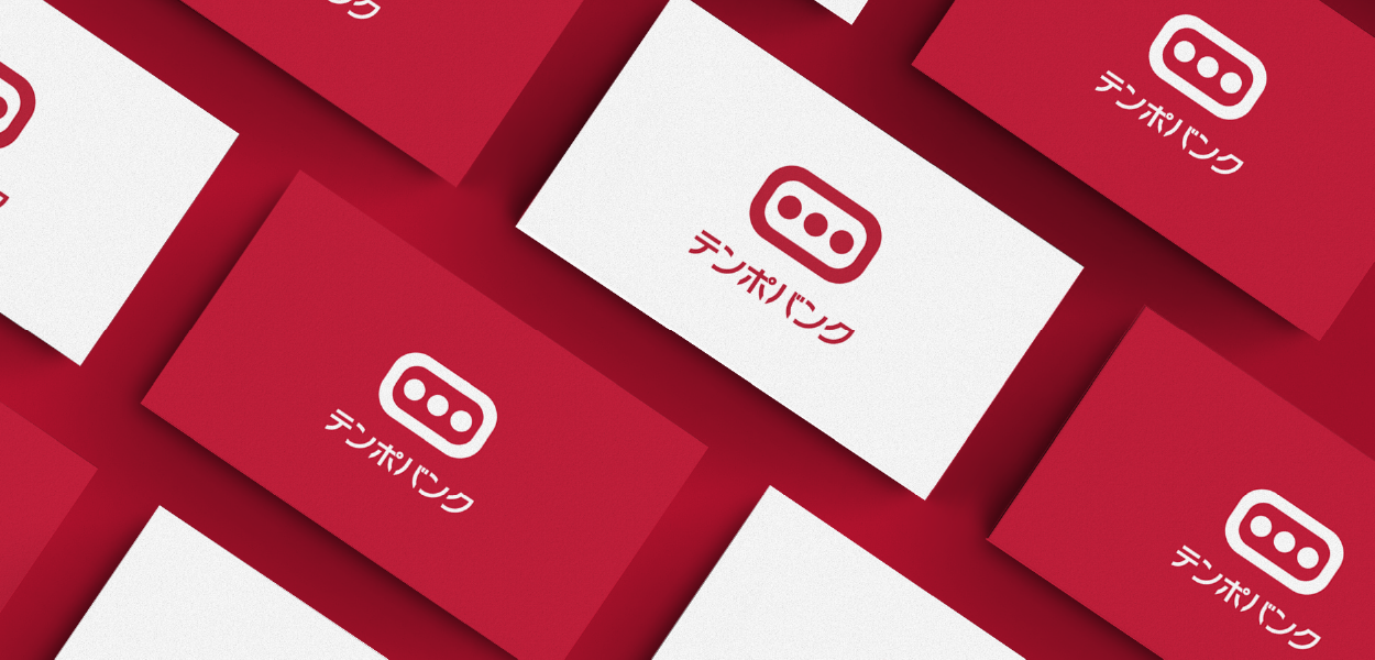
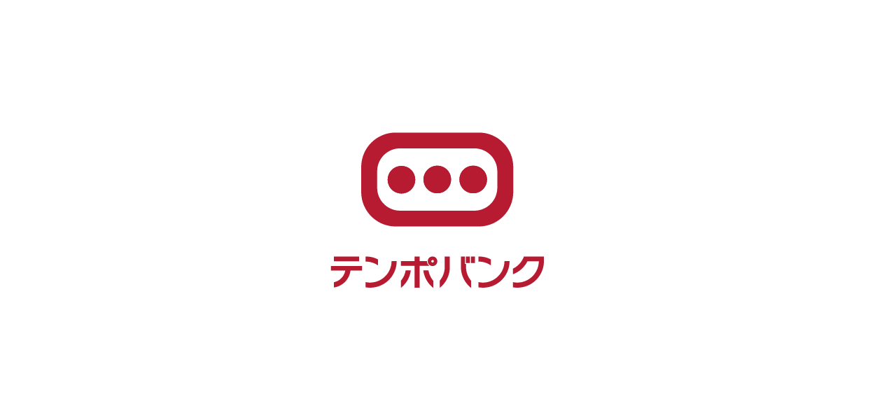
決定されたロゴ案は、「3つのドット」と「丸みを帯びた長方形」というシンプルな構成で成り立っています。3つのドットは、貸主・借主・自社の三者を象徴し、その周囲を囲む長方形は、三者が共に空間を共有し、協力して価値を創造していく様子を表現しています。
<本案の優位性>
テンポバンクが扱う物件は、業界内で通称「ハコモノ」と呼ばれることが多くあります。本案では、ひと目で「ハコモノ業界において三者が共創する」という事業構造を視覚的に伝えることができ、他案と比較しても、より明確に事業性を表現している点が大きな特徴です。
Font Elements
日本語フォントを使用したビジュアル・アイデンティティ(VI)には、「多くの日本人にとって視認性が高く、事業者名を直感的に認識しやすい」という大きな利点があります。ただし一方で、フォントの選び方によっては一気に俗っぽい印象を与えてしまうリスクもあり、その取り扱いは非常に繊細です。 今回のプロジェクトでは、掲社の名称が持つ印象や読みやすさ、そして信頼性の醸成に資することを重視し、文字の構造やバランスを丁寧に見極めながら、最適なフォントデザインを構築しています。


Overview
Tempo Bank Inc. is a Tokyo-based real estate firm specializing in comprehensive support for commercial store openings and closures. Acting as an intermediary between tenants and property owners, the company continuously pursues solutions that deliver optimal outcomes for both parties. For this project, Lemon Design Office was commissioned to develop the brand identity (VI) and produce the accompanying logo guidelines.
Sketch / Keywords
In the VI design phase, we began with in-depth interviews of core team members to surface Tempo Bank’s essential values. Two strategic keywords emerged: the shared growth of landlords, tenants, and the company itself; and a commitment to continuous improvement driven by on-site feedback. Guided by these principles, our initial sketches investigated visual expressions of growth, collaboration, and adaptability.
Proposal
We presented three concepts, from which Concept B was selected as the foundation for the final identity. Although the preliminary interviews established the core keywords, small differences in narrative interpretation naturally generated multiple design directions. From the shared premise that “landlords, tenants, and the company should grow together,” the work branched into three approaches:
A concept that reads as approachable and friendly to tenants.
A concept that communicates business capability in a direct, straightforward manner.
A concept that foregrounds the importance of communication.
Through continued dialogue and iterative refinement with the client, the final option was confirmed.
Logo Elements
The chosen logotype is composed of three dots and a rounded rectangle. The three dots symbolize landlord, tenant, and Tempo Bank; the enclosing rounded rectangle represents shared space and the co-creative process through which the three parties generate value together.
Competitive Advantage
Many of the properties Tempo Bank handles are colloquially referred to within the industry as “hakomono” (box-type properties). This design communicates—at a glance—that Tempo Bank operates within that sector and facilitates co-creation among three stakeholders. Compared with the alternative proposals, it more directly and clearly conveys the company’s business model.
Font Elements
Using Japanese type in a VI yields a major advantage: high legibility for the target audience and immediate recognition of the company name. That benefit comes with a caveat—type selection is delicate, because an inappropriate font can quickly undermine perceived credibility. For this project, we prioritized typefaces that enhance recognizability and convey trust, evaluating character structure and balance carefully to arrive at a typographic treatment suited to both present needs and future use.
Art direction, Visual identity development, Concept and Graphic design:LEMON DESIGN Office
https://www.lemonjp.com/