

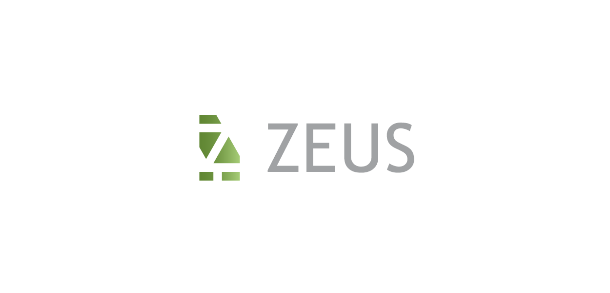
ZEUS INC.
Rebranding Project - Art direction, Visual identity development, Concept and Graphic design
Tips: English descriptions can be found at the end of the image gallery.

Overview
システム開発やNFTなど、IT領域において多角的に事業を展開してきた株式会社ゼウスは、これまでに培った技術力を基盤に、新たにWeb3を中核とするサービス展開へと舵を切りました。 これに伴い、企業としての姿勢や存在意義を再定義すべく、コーポレート・アイデンティティ(CI)の刷新に着手。私たちはその一環として、ブランド・アイデンティティ(VI)の設計およびロゴガイドラインの作成を担当しました。

Sketch / Keywords
ブランド・アイデンティティ(VI)を設計するにあたり、まずキーワードの抽出とスケッチの工程を行いました。本プロジェクトにおける中核のテーマは、事業の重心を「Web3」へと明確にシフトすることにあります。 一般的にWeb3は、ブロックチェーン技術を基盤とした分散型インターネットと定義されますが、今回のVI設計では、掲社が目指す「誰もが公平にデジタル社会へ参加できる基盤技術の提供」という中長期的なビジョンも、創造の軸として重視しています。
Proposal
5案を提示したうえで、最終的にA案を基軸としたデザインに決定しました。 事前のヒアリングで十分にキーワードを把握していたとしても、シナリオの解釈によって複数の方向性が導き出されることがあります。 そこで本提案では、各案が持つシナリオの違いを以下のように整理し、視覚的にも分かりやすく伝えるアプローチを取りました: X軸:事業内容を重視した図案か、ブランドストーリーを重視した図案か Y軸:視覚的インパクトの強いデザインか、親しみやすいポピュラーデザインか このフレームに基づき、5つのデザイン案が持つ立ち位置を明確に提示することで、意思決定の根拠を共有しやすくしています。

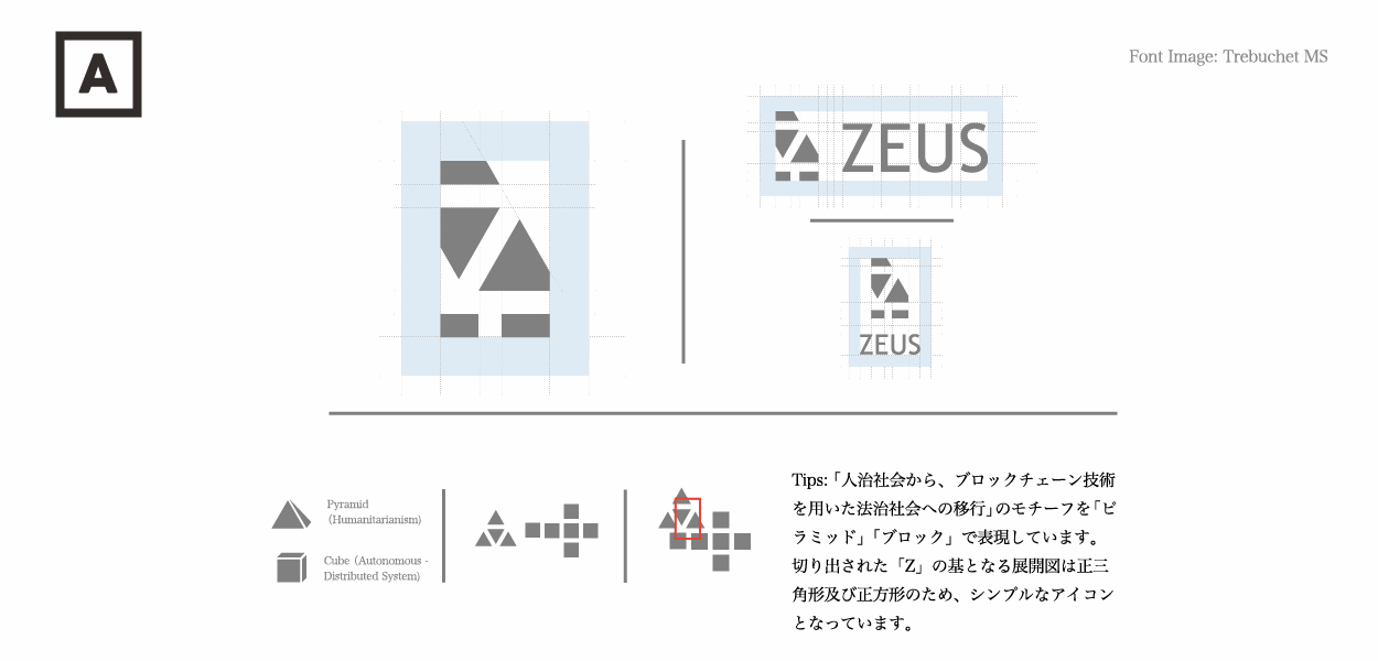
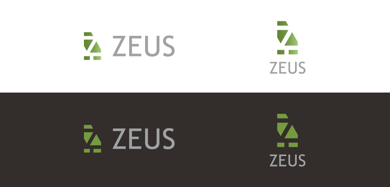
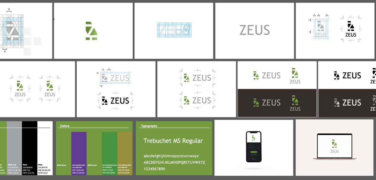
Logo Elements
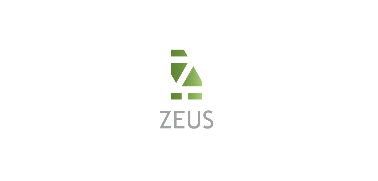
決定案は、ピラミッドとキューブの展開図を組み合わせて「Z」の文字を象ったデザインです。この「Z」は掲社名「Zeus」の頭文字であると同時に、旧来の構造と新たなパラダイムの転換を象徴する形状として設計されています。
<ピラミッド>
WEB2以前に見られた支配構造──すなわち「人治主義」を表しています。これは、誰もが情報発信できるようになった一方で、最終的なコントロールは少数のプラットフォーマーが握る非対称的な構造を指します。
<キューブ>
WEB3を象徴するブロックチェーン構造を表現しており、中央集権を前提としない「法治主義」に基づく分散型社会への移行を視覚化したものです。
この2つのモチーフが重なり合い、「Z」という形に再構築されることで、過去と未来の交差点に立つZeusのビジョンを明快に表しています。
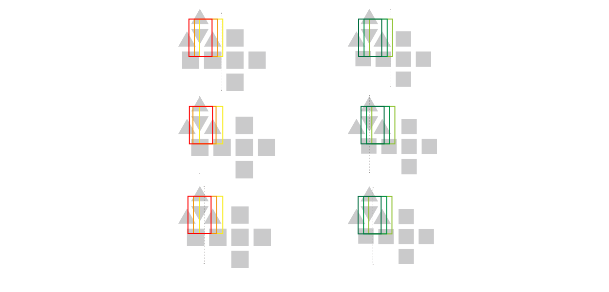

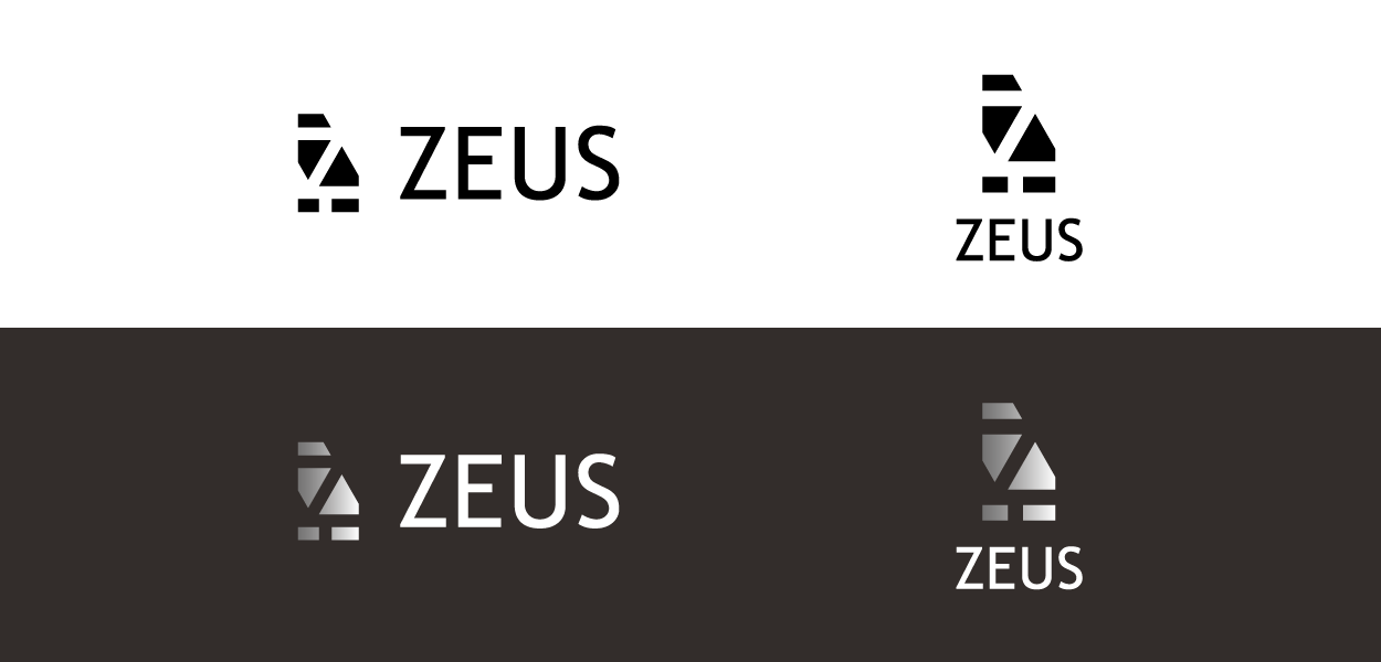
Trials
VI設計において、「ZがZとして視認できるか」は極めて重要です。この一見単純な問いが意外にも最終的なロゴ公開まで見落とされがちです。そのため、この工程では複数のパターンを試し、最も視認性の高い「Z」として明確に認識できるデザインを選定しました。


Overview
Zeus Inc. has long operated across the IT landscape—spanning system development, NFT initiatives, and more—and is now strategically pivoting to center its services on Web3. This shift is grounded in the company’s technical expertise and a broader ambition: to build infrastructures that enable fair, transparent participation in the digital economy. To reflect this new direction, Zeus initiated a redefinition of its corporate identity (CI); our agency was commissioned to design the brand identity (VI) and produce the accompanying logo guidelines.
Sketch / Keywords
We began by extracting core keywords and translating them into exploratory sketches. The project’s primary objective was to position the brand squarely within the Web3 domain while honoring Zeus’s longer-term vision: providing foundational technologies that let everyone engage equitably in digital society. These strategic anchors guided our early visual experimentation and concept development.
Proposal
From five initial concepts, the client selected Concept A as the basis for the final identity. Even with well-defined keywords from interviews, different narrative readings naturally generate divergent design directions. To make the differences clear and actionable, we mapped each proposal along two axes—business function vs. brand story (X-axis), and visual impact vs. approachability (Y-axis)—giving stakeholders a transparent framework for comparison and decision-making.
Logo Elements
The selected symbol forms a stylized “Z” by combining the unfolded geometries of a pyramid and a cube. The pyramid embodies the hierarchical dynamics of the pre-Web3 era—an asymmetric structure where a few platforms held ultimate control. The cube represents blockchain’s distributed architecture, visualizing a transition toward decentralized systems governed by transparent rules. Together, these motifs unify into a single form that communicates Zeus’s role at the intersection of legacy systems and future innovation.
Trials
A fundamental design criterion was simple but non-negotiable: the “Z” must read unmistakably as a “Z.” Although obvious in theory, this requirement is often overlooked until late stages. We therefore iterated multiple variations, selecting the version that maximizes legibility and immediate recognition while retaining conceptual depth.
Art direction, Visual identity development, Concept and Graphic design:LEMON DESIGN Office
https://www.lemonjp.com/